The Best Gray Paint Ideas for a modern home offer neutrality, versatility, and timeless appeal. Gray remains a popular choice for contemporary interiors, combining modernity with classic charm. This color provides a calming feeling; however, too much gray can sometimes zap your energy. Moderate use of gray paint with warm accents creates a soothing atmosphere. Different shades of gray offer various moods; warm gray is invigorating, while cool gray brings tranquility. This guide helps you confidently select the ideal neutral gray for your home.
Key Takeaways
Gray paint can make your home look modern and calm. Warm grays feel cozy, and cool grays feel peaceful.
Gray paints have hidden colors called undertones, like blue, green, or brown. These undertones change how the gray looks in your room.
Always test gray paint samples on your walls. This helps you see how the color changes with your room’s light during the day.
Natural light greatly affects gray paint. North-facing rooms make cool grays look colder, so warm grays work better there.
Understanding Gray Undertones
Understanding gray paint undertones is crucial for selecting the right shade for your home. Undertones are the subtle colors that appear within a gray, influencing its overall feel. You will find that these hidden hues determine if a gray feels warm or cool.
Warm vs. Cool Gray Paint Colors
Warm gray paint colors have undertones of yellow or brown. These shades often create a cozy and inviting atmosphere. A popular type of warm gray is “greige,” which blends gray with beige. Warm grays offer subtle nuances of white, creating a serene neutral. They possess a chameleon-like quality, appearing gray in some lights and warmer in others. You can use these colors to enhance colorful artwork or accessories in your space.
Cool gray paint colors, on the other hand, contain undertones of blue, green, or purple. These grays provide a sleek and modern feel. A cool gray is defined as any gray containing at least 5% of blue. You often choose these colors for spaces seeking an airy, fresh look. They work well for coastal decor or spa-like settings. Cool grays contain higher amounts of blues and greens, appearing more steely or icy. Examples include Benjamin Moore Stonington Gray, Sherwin-Williams Passive, and Behr Silver City.
Identifying Gray Undertones
Identifying gray paint undertones helps you avoid unexpected color shifts on your walls. A simple trick to determine a paint’s undertone is to look at the darkest color on its paint strip. If the darkest color on the strip is brown, the lighter shades on that strip will have a brown undertone. Similarly, if the darkest color is blue, the undertone will be blue.
You can also examine paint chips by color family. Paint chips are typically organized by color family in stores. This allows you to infer undertones. For instance, a gray with a green undertone would likely be found near other greens. Comparing swatches to pure white or other grays also helps. Holding a paint swatch next to a pure white surface or other classic gray samples can make subtle undertones (blue, green, purple) more apparent. Finally, observe the paint in different lighting conditions. Some gray paints are ‘chameleons.’ Their undertones become more obvious when applied to a wall and viewed under various lighting throughout the day. This includes testing in north-facing, south-facing, and east/west-facing rooms.
Top Gray Paint Colors for Modern Homes
You want to find the perfect gray for your modern home. Here are 15 top gray paint colors. These shades offer versatility and style. They are some of the best gray paint ideas for any contemporary space.
Sherwin-Williams Agreeable Gray: Versatile Greige
Sherwin-Williams Agreeable Gray (SW 7029) is a warm gray. It has green-gray undertones. This gray is a “chameleon” color. Its look can change. It might appear cool or violet if you do not pair it correctly. Poor lighting can also affect its appearance. For example, against a yellow-toned paint, Agreeable Gray’s gray undertones become clear. Next to a pink-toned paint, its green-gray undertones are very visible. This confirms its warm gray classification. Fixed elements like dark cherry wood floors can make this gray appear warmer. This emphasizes its green-gray undertones. Warm neutral flooring works well with it, assuming good lighting.
This is one of the best gray paint colors for its adaptability. It is highly versatile for cabinetry. Its soft undertones suit both warm and cool palettes. You can use it for full kitchens. It gives a neutral yet warm base. It works with almost any color scheme. Use it for kitchen islands. It adds contrast with lighter perimeter colors. It is great for two-tone kitchens. It complements darker shades well. You can also use it for built-ins and pantries. It brings timeless sophistication to these spaces.
Benjamin Moore Revere Pewter: Classic Greige
Benjamin Moore Revere Pewter (HC-172) is a sophisticated neutral. It balances gray and beige. This makes it neither too cool nor too warm. Its unique character comes from subtle green undertones. These undertones add depth and versatility. This “greige” color performs well in different lighting. This makes it a reliable choice for interior design. When you use Revere Pewter, consider these green undertones. This is especially true when you pair it with similar grays or beiges. This helps you avoid clashes.
You can use this gray in many ways. Create a peaceful bedroom sanctuary with light gray accents. Design a luxurious, spa-like bathroom. Use it with a Balboa Mist vanity and chrome fixtures. Make a warm living room with natural wood furniture. Add textured rugs. Create a welcoming entryway with a wooden console. Use woven storage. It works in a modern farmhouse kitchen with crisp white cabinets. Add black hardware. You can also use it as a living room focal point. Pair it with a white fireplace and black metal accents.
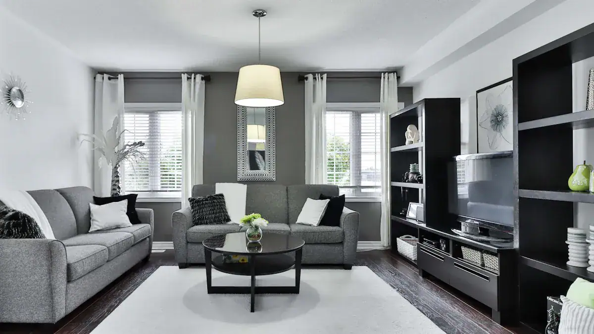
Sherwin-Williams Repose Gray: Popular Neutral
Sherwin-Williams Repose Gray (SW 7015) is a light to medium gray. It has balanced undertones. These include gray, beige, and slight hints of blue. This makes it a true greige. It can also show subtle hints of beige and blue. Sometimes, it gives off violet undertones. Repose Gray technically has beige/taupe undertones. These add warmth. They can sometimes flash slightly pink or purple. It can also show the slightest green undertone in darker rooms. These undertones make it versatile. It works well with both cool and warm colors. It prevents it from feeling cold.
This gray is a perfect neutral. It does not have strong undertones. It has more blue undertones than brown. However, it is not a blue-gray. It keeps a very warm gray feel. You can use it as the main wall color throughout your home. It provides a versatile neutral backdrop. Pair it with colors like White Duck for trim and cabinetry. This brightens spaces while keeping warmth. It is suitable for accent walls in home offices. It works in reading nooks to add depth. Complement it with furniture in colors like Sage. This adds a refreshing touch. Use decorative accents in colors like Copper Mountain or Tricorn Black. This adds contrast and sophistication. For exteriors, it offers a timeless look for siding. You can use it for trim and accents. It pairs well with darker roof shingles. It also works with bold accent colors for contrast.
Benjamin Moore Gray Owl: Light Cool Gray
Benjamin Moore Gray Owl (OC-52) is a calming gray. It has blue-green undertones. The specific look of these undertones changes. It depends on surrounding colors and lighting. This versatile neutral can bring tranquility and peace. It has a cool cast in ambient lighting. It does not look stark. This gray is ideal for cabinetry or trim. It also serves as a subtle backdrop for any room. It blends well with almost any color. It highlights furnishings and art. You can use it in a dental office waiting room. Its walls, with light gray chair fabric, harmonized with a subtle blue stripe in the carpet. This shows its ability to complement existing color schemes.
Benjamin Moore Classic Gray: Soft & Subtle
Benjamin Moore Classic Gray (OC-23) is a creamy pale gray. It has warm undertones. This sets it apart from grays with cold, bluish tones. It features subtle warm undertones of purple. Sometimes, it shows a soft pink. As an off-white, its undertones can shift. This depends on the environment. For example, lots of greenery outside might make it subtly flash green. It has a passive purple undertone. You often do not notice this in most settings. It is very versatile. It suits stucco, brick, and siding. It works with contemporary, modern, traditional, transitional, and farmhouse styles. It is a warm off-white rather than a true gray. This makes it an excellent base color for home exteriors. It is an ideal choice for bedrooms. It provides an airy yet warm and cozy feel. This makes it one of the top light gray paint colors for master bedrooms.
Benjamin Moore Stonington Gray: Crisp Cool Gray
Benjamin Moore Stonington Gray (HC-170) has strong blue undertones. People often describe it as a blue-gray color. These undertones become clearer in certain lighting. They also show when compared to other gray paint colors. For example, compare it to Revere Pewter (green undertones). This versatile paint works for many areas in your home. It works well for kitchen cabinets. It offers a bright alternative to white, but less stark. In living rooms, it is an excellent foundation color. This is especially true in open-concept spaces. Its neutrality pairs with diverse furniture and decor. You can also use it in bathrooms and laundry rooms. It creates a unified look when applied to walls and ceilings. It complements darker elements like charcoal black vanities.
Sherwin-Williams Light French Gray: Elegant & Airy
Sherwin-Williams Light French Gray (SW 0055) is a true gray. It achieves a near-pure gray. It has a balanced mix of warm and cool tones. It does not have dominant undertones. However, its undertones can shift to blue or purplish. This happens especially in north-facing rooms. This makes the paint appear cooler and slightly blue. The lighting and location of a space influence these undertones. While it is mainly a true gray, it can show a slight purple undertone. It can also appear blue in northern light. This gray is a versatile warmish/coolish gray. It performs well in spaces with good lighting. It is a good choice for a neutral gray shade. Avoid using it in poorly lit areas like hallways. This can make the color look muddy and gloomy. It has violet undertones. It appears cool in rooms with cool northern light. It can lean slightly warmer in warmer lighting. It never becomes truly warm. These violet undertones can also look like a touch of blue in northern light. This is one of the best gray paint ideas for home exteriors. As a mid-tone color, it resists looking washed out in natural light. It complements landscaping well.
Benjamin Moore Balboa Mist: Warm Greige
Benjamin Moore Balboa Mist (OC-27) is a lighter greige. It has subtle purple and taupe undertones. Its appearance can change. It looks warm and inviting in direct sunlight. It becomes cooler and more muted in shaded areas. Balboa Mist is warm and friendly. It can sometimes show a green undertone in warm sunshine. Its soft violet undertones help it pair well with different light conditions. It works with various colors and hard finishes. You can use it for cabinets. This is especially true with decor that has violet undertones. It is a great alternative when white or off-white colors are too bright. It also works when creamier whites are too yellow. It is excellent for exterior white trim. It appears as a bright white without harshness. It makes a great whole-house white paint color. This is particularly true in heavily wooded lots. Its warmth neutralizes green tones from foliage. It is ideal as an exterior paint color. It gives a refined look to contemporary and classic homes. This includes farmhouses and ranches. It enhances textures of brick, stucco, and siding. It can be a stunning central color for your entire home. You can use it on trim, shutters, and doors as an accent color. It pairs well with darker accents for contrast. It also works with lighter shades for a softer palette.
Sherwin-Williams Mindful Gray: Balanced Greige
Sherwin-Williams Mindful Gray (SW 7016) is a warm mid-tone gray. It has green, taupe, and purple undertones. The visibility of these undertones varies. It depends on lighting and furniture. For instance, in darker rooms, the green undertone may be more apparent. In light-filled rooms, it looks more like a warm gray. This gray is suitable for exterior paint. It works for kitchen cabinets, especially with good natural light. You can pair it with many coordinating colors. Avoid using Mindful Gray in dark spaces. In east-facing rooms, it might look beautiful in the morning. It can appear dark and muddy in the afternoon. North-facing rooms may look too dark all day. If you pair it with dark wood furnishings, a green undertone might show. You can minimize this with bright white trim and lighter furnishings.
Benjamin Moore Edgecomb Gray: Popular Greige
Benjamin Moore Edgecomb Gray (HC-173) is a versatile warm neutral. It has a virtually neutral undertone. Depending on the light, its undertones can appear slightly green or a tiny bit pink. The undertone of Benjamin Moore Edgecomb Gray is a green-gray. It is not a typical warm gray. Its green-gray undertones are less strong than in BM Revere Pewter. This gray is ideal for whole-house color schemes. It suits open-concept living spaces. It is excellent for hallways, stairwells, and entryways. It functions as a perfect greige neutral for walls. Use it in an accented neutral color palette. It pairs well with earthy fixed elements. These include cherry wood flooring or beige carpets. It is versatile for exterior use. This includes the main body of a home, trim, or shutters. You can use it as a creamy trim paint color. It does not have strong yellow undertones. It leans toward the warmer side of warm grays. This makes it a good choice when paired correctly. As a kitchen cabinet paint color, it pairs well with both cool and warm kitchen countertops.
Benjamin Moore Coventry Gray: Deep Cool Gray
Benjamin Moore Coventry Gray (HC-169) is a deep cool gray. It has soft blue and green undertones. These give it a “stormy” or “smokey” look. It is a slightly cool gray. It will not make a room feel cold. It can balance bright natural sunlight. Its subtle blue undertones provide a soft yet stormy quality. A hint of green occasionally shows through. This is one of the best dark gray paint colors. You can use it for interiors. This includes cabinets, kitchens, kitchen islands, and accent walls. It works in living rooms, bedrooms, bathrooms, laundry rooms, and home offices. For exteriors, use it as a main field color. It works for trim, half-timbering, stucco, brick, and lap siding. It suits many home styles. These include coastal, farmhouse, modern, contemporary, traditional, and transitional. It is versatile for various materials.
Sherwin-Williams Oyster White: Taupe-y Gray
Sherwin-Williams Oyster White (SW 7637) is a cool-leaning light greige. It has very subtle green undertones. It has a mix of gray, beige, and subtle green undertones. These make it soft, creamy, and able to shift color. Oyster White is a warm paint color because of its green undertones. Green is the most neutral and easiest undertone to work with. This is true among greige and gray paint colors. You can use this gray in hallways, entryways, and laundry rooms. It works in home offices, playrooms, bedrooms, and bathrooms. It is great for living rooms, kitchens, and cabinets. It is also good for exteriors. It suits modern, traditional, minimalist, contemporary, mid-century, and farmhouse-style homes. It is recommended for home exteriors. It creates a cozy and welcoming atmosphere. Designers favor it for traditional homes, cottages, and farmhouses. It can also work as an accent hue.
Farrow & Ball Elephant’s Breath: Unique Warm Gray
Farrow & Ball Elephant’s Breath (No. 229) is a warm mid-gray. It has a hint of magenta. It can also appear lilac. This depends on the lighting. It has pink/violet undertones. This unique gray is suitable for living room walls and bedroom walls. It pairs well with other Farrow & Ball shades. These include Cornforth White, Blue Gray, Brinjal, Charleston Gray, and Mahogany.
Behr Dolphin Fin: Modern Mid-Tone Gray
Behr Dolphin Fin (790C-3) has a unique balance. It has warm beige undertones and subtle cool blue undertones. This combination keeps it from leaning too warm or too cool. This is one of the best gray paint ideas for its balanced nature. Its ideal applications include living rooms. It provides a soft, inviting backdrop. Use it in bedrooms. It offers a light and calming atmosphere without feeling cold. It works in kitchens and bathrooms. It serves as a fresh alternative to traditional white. For home exteriors, it is a classic gray. It complements brick or stone. Use it on interior doors, cabinets, and furniture. It creates a subtle contrast against white walls.
Valspar Gravity: Clean & Contemporary
Valspar Gravity (4005-1A) is a clean and contemporary gray. It has a cool undertone. This gray paint shade offers a sleek look. It works well in modern spaces. You can use this gray in rooms where you want a crisp, fresh feel. It is a good choice for a modern aesthetic.
Selecting the Best Gray Paint Colors
Light’s Impact on Gray Shades
You must understand how natural light affects gray paint colors. Light changes how gray appears in your home.
North-facing rooms receive cool light. Avoid gray with cool undertones here. These make the room feel colder. Instead, choose warm undertone grays to balance the light. Look for grays with a higher Light Reflectance Value (LRV). This makes the room appear lighter.
South-facing rooms have consistent warm light. Most colors work well here. Neutral-toned gray may appear warmer. Cool-toned gray, like Repose Gray SW 7015, may look more neutral.
East-facing rooms get warm light in the morning. They have cool light in the evening.
West-facing rooms have cool light in the morning. They get warm light in the evening.
Light intensity also matters. A cool gray can feel “extra cold” in north-facing rooms. These rooms have cool, indirect light. In south-facing rooms, which get consistent warm light, cool gray tones help balance the light’s intensity. This creates a comfortable and calm environment.
Testing Gray Paint Samples
Testing paint samples is crucial for choosing gray paint. You need to see how the paint looks in your space.
Swatch paint samples on walls. This shows you how the color interacts with your home’s natural light. It also shows how it looks at different times of day. You see it with your existing decor.
Observe over a 24-hour period. Watch how the paint color changes. See how undertones appear throughout the day and night.
Avoid painting directly on walls. This prevents texture problems. It also avoids sanding before the final paint job. Instead, create oversized paint samples on poster board. Paint two coats on a poster board. Use double-sided or painter’s tape to hang it on the wall. You can move these samples around the room. This tests them in various lighting conditions. It also tests them against different surfaces.
Coordinating Gray with Decor
Harmonizing gray paint with your decor makes your home cohesive. Experiment with gray’s undertones. Gray’s neutrality depends on its undertone. This can be cool blue, warm taupe, or green. It reacts differently with light. Testing samples helps you select an undertone. This emphasizes your furniture and artwork.
Consider a two-tone wall. Use a darker gray on the bottom. Use a lighter shade above. Or, use a deep charcoal accent wall. This anchors a space. It does not make it feel cramped.
Incorporate textured finishes. Use matte plaster or subtle limewash. This adds depth without overwhelming color. Ground your design with wood and warm metals. Pair gray with warmer elements. Use oak tones, brass hardware, and leather. This creates contrast and coziness. It prevents a cold, clinical feel.
Paint sheen also influences the final look of gray paint colors. Flat paint absorbs light. It offers the truest color representation. Eggshell and satin finishes reflect some light. They create subtle luminosity. This can make colors appear lighter. Semi-gloss and gloss finishes reflect much light. They can diminish color intensity. They create dynamic highlights and shadows. These variations are more pronounced with darker gray paint colors.
You now understand the versatility and enduring appeal of gray paint in modern homes. These best gray paint ideas guide your choices. Remember undertones, test samples, and consider light’s impact. Confidently select a gray shade that reflects your personal style. It will enhance your living space. Use these best gray paint ideas to transform your home. Share your favorite gray paint experiences below!
FAQ
What is the difference between warm and cool gray paint?
Warm gray paint colors have yellow or brown undertones. They create a cozy feel. Cool gray paint colors contain blue, green, or purple undertones. They provide a sleek, modern look. Your choice depends on the mood you want for your room.
How do I identify gray paint undertones?
Look at the darkest color on the paint strip. This often reveals the undertone. For example, a dark brown on the strip means brown undertones. You can also compare swatches to pure white. Observe the paint in different lighting conditions.
Why should I test gray paint samples?
Testing samples shows you how the color looks in your space. Light changes how gray appears. You see how undertones shift throughout the day. This helps you avoid unexpected color changes. Always test samples on your walls.
What is greige paint?
Greige paint is a type of warm gray. It blends gray with beige. This combination offers a versatile neutral. Greige can appear warmer or cooler depending on the light. It works well with many color palettes.