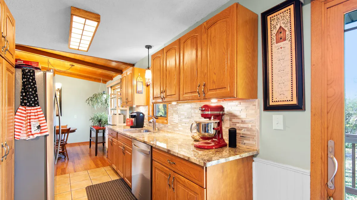
You have existing oak cabinets and want a fresh, modern look without the expense of a full renovation. This is a common dilemma! While your oak cabinets are incredibly durable, their warm tones can sometimes make your kitchen feel a bit dated. But you don’t need to completely overhaul your space.
Painting your cabinets offers a smart, budget-friendly solution. For instance, painting kitchen cabinets can save you thousands compared to replacing them entirely. This blog will give you practical, stylish paint color schemes that work with your oak cabinets, not against them. The right paint can neutralize unwanted undertones, brighten your kitchen, and create a cohesive design for your space.
Understanding Oak Cabinet Tones
Identifying Oak Undertones
You have oak cabinets. But did you know not all oak is the same? Each type of oak has its own unique undertones. These are the subtle hues you see beneath the main color. Identifying these undertones is your first step. It helps you pick the best paint colors.
Oak Type | Common Undertones/Hues |
|---|---|
White Oak | Taupe, gray, and beige |
Red Oak | Pinkish and reddish hues |
White oak often shows taupe, gray, or beige. Red oak, on the other hand, usually has pinkish or reddish hues. These undertones in your oak cabinets will guide your paint choices. If you have red oak, you might want to pick a paint that tones down the pink. If you have white oak, you might lean into its neutral base.
Light’s Impact on Paint Colors
Light plays a huge role in how your kitchen looks. The same paint can appear very different in various lighting. Natural light from windows changes throughout the day. Artificial light from your fixtures also affects how colors appear. Always test your paint samples on your walls. Look at them at different times. See how the light hits your oak cabinets. This helps you choose the right paint. For example, a paint color might look cool in bright morning light but warmer in the evening. This also applies to your cabinets; light can make their undertones more obvious or less so.
Warm vs. Cool Colors with Oak
Oak cabinets naturally have warm tones. They often lean yellow, orange, or red. You can choose paint colors that work with this warmth or create a contrast. Warm colors like yellow make a kitchen feel cheerful and inviting. They can boost energy. Cool colors, such as blues and greens, bring a sense of calm. They help you relax.
Color | Psychological Effect in Kitchen |
|---|---|
Yellow | Bright, cheerful, creates a warm and welcoming atmosphere, perfect for family gatherings. |
Blue | Calm, soothing, reduces stress, promotes relaxation, ideal for a serene kitchen space. |
Green | Associated with nature, creates harmony and balance, excellent for a healthy kitchen environment. |
Pairing warm paint with your warm oak cabinets can make the space feel cozy. But sometimes, it can make the oak look too yellow or orange. Cool colors can neutralize some of that warmth. They can also make your oak cabinets pop. Think about the mood you want. Do you want an energizing space for cooking and gathering? Or do you prefer a serene spot to unwind? Your choice of paint colors makes a big difference in the overall feel of your kitchen.
Timeless Neutral Paint Schemes
You want to update your kitchen. Neutral paint color schemes are a safe and stylish bet. They offer a timeless look. These colors work with your oak cabinets. They do not clash. Neutrals can brighten your space. They also create a sophisticated backdrop.
Crisp Whites and Soft Creams
You want to brighten your kitchen. Crisp whites and soft creams are excellent choices for your oak cabinets. These colors offer a clean, fresh look. They can make your kitchen feel more spacious. They also provide a beautiful contrast to the warm tones of your oak cabinets.
For crisp whites, you have many options.
Benjamin Moore’s Chantilly Lace (OC-65) is a cool white. It has a very subtle blue undertone. This color offers a bright and clean hue. It highlights the natural beauty of your oak wood.
Benjamin Moore’s White Dove (OC-17) is a warm white. It has subtle creamy undertones. This paint provides depth and a warm, crisp backdrop. It is versatile for many design styles.
Sherwin-Williams Alabaster (SW 7008) is another warm white. It has slight beige undertones. This adds unique depth and character. It highlights the natural warmth of your oak cabinets. It creates a brighter, inviting space.
Benjamin Moore’s Swiss Coffee (OC-45) is a warm white. It has subtle yellow and gray undertones. This creates a creamy and inviting atmosphere. It harmonizes beautifully with oak shades.
Sherwin-Williams Snowbound (SW 7004) is a creamy off-white. It has subtle pink undertones and a hint of cool gray. This acts as a chameleon. It complements warm oak wood tones.
Benjamin Moore’s Classic Gray (OC-23) is an off-white. It has subtle gray undertones despite its name. It offers depth without being stark. It complements the warm, honeyed hues of oak.
Benjamin Moore’s Decorator’s White (OC-149) is a cool white. It has subtle blue-grey undertones. It provides a serene and elegant choice. It adds a crisp contrast to lighter oak wood tones.
Sherwin-Williams Pure White (SW 7005) is a soft and slightly warm white. It has subtle undertones that can lean cool or warm. It blends seamlessly with most wood tones. It creates a warm, inviting atmosphere with lighter oak.
Benjamin Moore’s Atrium White (OC-145) is a warm white. It has subtle yellow-pink undertones. It beautifully complements the natural warmth of oak wood. It adds coziness.
If you prefer soft creams, these colors also work well.
Benjamin Moore White Dove OC-17 is a slightly creamy white. It warms up your oak cabinets in a subdued, calming way.
Sherwin-Williams Natural Linen SW 9109 is a creamy beige. It has a slight yellow tinge. It brightens a space without being overbearing. It allows your natural wood cabinets to stand out.
Sherwin-Williams Canvas Tan SW-7531 is a warm, crisp khaki. It is both light and bright, yet cozy. It brightens your oak cabinets while maintaining their warm look.
Magnolia Home Dutch Tulip is a soft and creamy pastel. It has a hint of orange. It blends beautifully with all types of natural wood. This includes those with yellow and red undertones.
Farrow and Ball Clunch No. 2009 is an ivory white. It has a slightly yellow base. It complements your oak cabinets nicely. It feels fresh and crisp without being overly warm. It creates a timeless farmhouse feel.
Versatile Greige Paint Colors
Greige is a fantastic choice for your kitchen. It mixes gray and beige. This makes it a perfect bridge between warm and cool colors. Greige paint colors can neutralize the strong yellow or orange tones in your oak cabinets. They offer a sophisticated, modern look. You get the best of both worlds with greige. It provides warmth without being too yellow. It also offers coolness without feeling stark.
Consider Sherwin-Williams Repose Gray. This is a calming, light warm gray. It has subtle beige undertones. It works beautifully with oak cabinets. It helps to update your kitchen’s overall feel. This paint color scheme is very popular. It gives your kitchen a fresh, contemporary vibe.
Earthy Neutrals for Oak Cabinets
You might want a grounded, natural feel in your kitchen. Earthy neutrals are perfect for this. These colors include soft taupes, muted greens, and warm beiges. They complement the natural wood grain of your oak cabinets. They create a harmonious and inviting atmosphere. These colors enhance the warmth of your cabinets without making the space feel dated. They bring a sense of calm and connection to nature.
Think about a soft, muted sage green. It can bring a touch of the outdoors inside. A warm taupe can add depth and sophistication. These colors work well with your existing oak cabinets. They create a cohesive and timeless design.
Modern Cool Paint Palettes
You might want to give your kitchen a fresh, contemporary feel. Cool paint colors are a great way to do this. They offer a striking contrast to the warm tones of your oak cabinets. This approach can make your space feel updated and serene.
Serene Blues and Greens
Imagine a calm, peaceful kitchen. Blues and greens can create this atmosphere. These colors bring a sense of tranquility to your home. They also beautifully balance the inherent warmth of your oak cabinets.
Sherwin Williams Sea Salt (SW 6204): This color is a beautiful blue-green. It has gray undertones. It can look more blue or more green depending on the light in your kitchen. This neutral blue pairs well with lighter oak cabinets that have less orange. It offers a soft, airy feel.
Benjamin Moore Hale Navy (HC-154): If you want a bolder look, consider this deep, rich blue. It offers a dramatic contrast. This color effectively neutralizes the orange tones often found in oak cabinets. It gives your kitchen a sophisticated edge.
These serene colors can transform your space. They make your oak cabinets feel new again.
Sophisticated Gray Paint Colors
Gray is a versatile choice for modern kitchens. It provides a sophisticated backdrop. Gray paint colors can help tone down the yellow or orange hues in your oak cabinets. They create a balanced and stylish look.
Sherwin Williams Iron Ore (SW 1069): This is a dark, charcoal-like gray. It has cool tones. It provides a good contrast to lighter wood. This color adds a touch of drama and sophistication to your kitchen.
Sherwin Williams Accessible Beige (SW 7036): This popular beige has slight gray undertones. It prevents the color from looking too yellow. This means it will not enhance the orange in your oak cabinets. It creates a more monochromatic feel.
Sherwin Williams Mindful Gray (SW 7016): This color is a greige. It combines beige and gray. It leans heavily towards gray. It has a hint of blue. This blue helps balance the warm yellows of oak without making the space feel too icy.
These grays offer a modern palette. They work well with your existing cabinets.
Pairing Cool Tones with Oak Kitchen Cabinets
You can successfully pair cool tones with your oak kitchen cabinets. The key is to balance the warmth of the wood. Oak cabinets often have orange tones. You can choose colors from the opposite side of the color wheel. Blues and greens are great examples. You can also use grays and greiges with cool undertones. This approach helps to neutralize the warmth. It creates a harmonious and updated look.
When you select a paint color, think about the overall palette. You want a cohesive design. Cool colors can make your oak cabinets pop. They bring a fresh perspective to your kitchen. This strategy ensures your space feels modern and inviting.
Bold & Contrasting Paint Colors
You can make a big statement in your kitchen. Choose bold and contrasting paint colors. These choices create a modern and striking look. They work well with your existing oak cabinets. This approach gives your kitchen a fresh, updated feel.
Dramatic Deep Blues and Greens
Deep blues and greens offer a dramatic contrast. They look stunning with oak cabinets. These colors can neutralize the warm tones of your wood. They give your kitchen a sophisticated edge.
Consider these deep blue paint colors:
Benjamin Moore Hale Navy (HC-154): This deep navy has subtle green undertones. Designers love its versatility. It creates stunning contrast.
Sherwin-Williams Naval (SW 6244): This classic navy works well with natural wood tones. It offers a sophisticated backdrop. It adds depth.
Farrow & Ball Hague Blue (30): This deep green-blue makes a dramatic statement. It looks great with natural stone and brass hardware.
Benjamin Moore Van Deusen Blue (HC-156): This muted navy has gray undertones. It offers understated sophistication for transitional kitchens.
Sherwin-Williams Salty Dog (SW 9177): This vibrant navy brings intensity to contemporary kitchens. It creates striking contrast against lighter elements.
You can also use deep greens. Bancha is a deep, rich olive green. It offers a timeless and rugged feel. It brings a countryside look into your kitchen. It is a grounded and classic color. It has distinct character. Other deep green options include:
Ripe Olive (SW 6209): This deep, rich green makes a bold statement. It pairs well with brass or gold hardware for a luxurious feel.
Backwoods (CC-630): This deep, forest green brings nature indoors. It creates a dramatic and cozy kitchen environment.
Essex Green (HC-188): This rich, dark green adds drama and elegance to cabinets. It suits both modern and vintage kitchen designs.
Sharp Blacks and Charcoals
Blacks and charcoals create a high-contrast design. They look amazing with oak cabinets. The beauty of earthy wood next to clean black cabinets creates an unmatched look.
Here are some great black and charcoal paint options:
Benjamin Moore’s Flint: This is a cooler charcoal. It offers an updated neutral look.
Benjamin Moore’s Kendall Charcoal: The brand describes this color perfectly. It is a rich, deep gray.
Behr’s Cracked Pepper: This was the 2024 color of the year. It is a versatile soft black. It elevates any room. It is a very dark gray that often looks black. It gives you the beauty of black paint without full commitment to a deep black.
Sherwin Williams Tricorn Black
Benjamin Moore Cheating Heart
Farrow & Ball Studio Green
Farrow & Ball Railings
Sherwin Williams Carbonized
Farrow & Ball Off Black
BEHR Broadway
High-Contrast Paint Color Schemes
You can successfully use high-contrast paint color schemes. Balance light and dark elements. Lighter oaks keep the space bright. Darker stains add depth. Enhance contrast with black metal edges or deep stone countertops. Focus on small zones of intensity. For example, use a black range hood against white cabinetry. Ensure oak grains run in the same direction for a refined feel. This creates order. Layer textures like concrete backsplashes or rattan pendant lights. This adds depth. Avoid mixing white paints with different undertones. They can clash. For high contrast, consider creamy beige paint colors with yellow undertones. These work better than stark whites. Dark gray, like Benjamin Moore Kendall Charcoal, works well with oak. Medium to dark green is also a good color to warm up oak wood. This thoughtful palette makes your kitchen stand out.
Warm & Inviting Paint Colors
You want your kitchen to feel extra cozy and welcoming. Warm and inviting paint colors are your perfect solution. These colors enhance the natural warmth of your oak cabinets. They are especially great for smaller or darker kitchens. They make the space feel brighter and more inviting.
Golden Yellows and Terracottas
Consider golden yellows and terracottas. These colors bring a sunny, earthy vibe to your kitchen. They instantly make the room feel more cheerful and full of life. Softer, muted variations like honey or terracotta lend a more sophisticated and grounded feel when paired with your wooden cabinets. They avoid the harshness of brighter shades. Imagine an amber-colored wall. Pair it with natural oak cabinets and bronze hardware. This evokes the richness of autumn. It enhances the overall warmth of the space. These paint colors create a cheerful and inviting palette. They make your oak cabinets shine, giving them a refreshed and harmonious look.
Soft Sage and Mint Greens
Soft sage and mint greens also work wonders. These greens have warm undertones. They complement your oak cabinets beautifully. A soft sage green can bring a calming, natural feel. It makes your kitchen feel like a peaceful retreat, connecting you with nature. Mint green offers a fresh, subtle pop of color. It brightens the space without overwhelming your existing cabinets. This color palette feels organic and harmonious. It adds a touch of serenity, making your kitchen a truly pleasant place to be. You will find these greens surprisingly versatile.
Enhancing Warmth in Your Kitchen
You can truly enhance the warmth in your kitchen. These specific paint colors work with your oak cabinets. They create a cohesive and inviting atmosphere. They make your kitchen feel like the heart of your home. You will love how these colors transform your space. They make it feel fresh, cozy, and uniquely yours. This thoughtful palette ensures your kitchen is always a warm and inviting place for family and friends. It celebrates the natural beauty of your oak.
Cohesive Design Elements
You have chosen great paint colors for your kitchen. Now, let’s tie everything together! Hardware, countertops, backsplashes, and flooring are like the finishing touches. They make your kitchen feel complete and stylish.
Hardware Finishes for Oak Cabinets
Choosing the right hardware for your cabinets makes a big difference. It can update the whole look of your oak cabinets. For a luxurious feel, gold hardware looks stunning with white oak. If you want something modern, brushed aluminum hardware adds depth with its matte finish. Modern silver hardware brightens your kitchen and makes it look bigger. Polished nickel creates a subtle, elegant contrast with oak’s warm tones. For a classic glam style, brass hardware perfectly matches the natural warmth of your cabinets. If you like a rustic look, try black iron hardware. For a sleek, contemporary kitchen, chrome black hardware offers a striking contrast.
Countertop and Backsplash Pairings
Your countertops and backsplash are key players in your kitchen’s overall design. They can either blend in or stand out. For countertops, popular choices include granite, quartz, and butcher block. You can pick neutral colors like beige, cream, or gray quartz for a safe bet. If you want a bold look, black granite or even red can make a statement. White marble adds luxury, while butcher block gives a charming, rustic feel. Remember, you don’t have to match everything perfectly; contrasting colors often make both elements pop!
For backsplashes, you have so many fun options!
Patterned tiles like Elipse Azul can add a funky touch, especially with light oak.
Dark colored tiles, such as Wave Blue Reef, bring richness to darker wood cabinets.
Metallic patterned backsplashes add glamour and shine.
Handmade-look subway tiles give a traditional kitchen charm.
Zellige tiles offer unique character that pairs perfectly with natural wood.
Crisp white tiles, like Hex Matte White, work with all wood tones and any paint colors you choose for your walls. This creates a versatile palette.
Flooring to Complement Paint Colors
Finally, let’s talk about the floor. It sets the foundation for your kitchen’s style. White tile flooring makes your oak cabinets stand out and brightens the space. Terracotta flooring brings a rustic, warm vibe that complements oak’s richness. Dark brown wood flooring creates a striking contrast, making your cabinets appear lighter. If you prefer an open, airy feel, light wood flooring works well with medium to dark oak. Gray stone tile flooring balances oak’s warmth with cool tones, creating a sophisticated palette. Beige tile flooring harmonizes with oak’s undertones, boosting warmth. To avoid a monotonous look, add strong accents like vibrant-painted walls.
Practical Kitchen Painting Tips
You are ready to transform your kitchen. Good preparation and smart choices make all the difference. These practical tips help you achieve a professional-looking finish.
Sampling Paint Colors Effectively
You need to choose the right paint colors. Sampling is crucial. Do not just look at small chips. You should paint large swatches directly on your walls. Make them at least two feet by two feet. Apply two coats of the sample paint. This ensures you see the true color. You can also paint swatches on poster board with a white border. This helps if your current wall color influences your perception. Place these swatches on different walls. Observe them under various lighting conditions. Look at them in morning, afternoon, and evening light. Consider how natural light from different room orientations affects the color. Also, think about your artificial lighting. It significantly alters how colors appear. Test your chosen paint colors against existing furnishings. This ensures harmony. Live with your samples for at least a full week. This lets you see how they change throughout the day.
Wall Preparation for Best Results
Proper wall preparation is key for a durable finish. First, you must clean your walls. Remove dust, dirt, and grease. Use a mild detergent and water. For your kitchen, a stronger cleaner might be necessary. Rinse and dry the walls thoroughly. Next, repair any imperfections. Fill holes, cracks, and dents with spackling compound. Sand these areas smooth once they dry. Lightly sand the entire wall with fine-grit sandpaper. This creates a surface for better paint adhesion. Remove all dust afterward. Then, apply a suitable primer. This creates a uniform base. It hides imperfections and enhances adhesion. Primer also prevents stains and improves paint durability. Let it dry completely. Finally, use high-quality painter’s tape. Mask off trim, baseboards, and ceilings. This gives you clean lines. Remove the tape while the paint is slightly damp.
Choosing the Right Paint Sheen
The right paint sheen protects your walls and looks great. For kitchen walls, satin sheen is a popular choice. It has a soft glow. Satin resists dirt and is very durable. You can clean it easily. Semi-gloss sheen adds more shine. It is highly durable. This sheen stands up better to scrubbing. It is also moisture-resistant. Semi-gloss is popular for its balance of durability and style. It handles constant activity and spills well. For kitchen cabinets, you need a paint with some shine. This ensures durability. Cabinets are frequently touched. They experience significant wear. Avoid flat paint for cabinets. Proper preparation, including double priming, is crucial for cabinet painting.
You can update your kitchen with oak cabinets. This is an achievable and impactful project for your cabinets. Understanding your oak cabinets and choosing the right paint color schemes leads to a stunning transformation. Experiment with paint samples. Trust your vision for your kitchen. You can create a fresh, modern space. Your cabinets will look uniquely yours with new paint color schemes.
FAQ
How do I pick the best white paint for my oak cabinets?
You should test white paint samples. Look for whites with subtle warm or cool undertones. This depends on your oak’s specific hue. See how they look in your kitchen’s light.
Can I really use dark colors with oak cabinets?
Absolutely! Dark blues, greens, or charcoals create stunning contrast. They make your oak cabinets pop. This gives your kitchen a modern, sophisticated feel.
What if my oak cabinets are very orange?
Try cool-toned paints. Blues, greens, or greiges can neutralize orange. They balance the warmth. This makes your oak cabinets look less orange and more updated.
Do I need to prime my walls before painting?
Yes, you absolutely need to prime. Primer creates a smooth base. It helps the paint stick better. It also ensures your new color looks true and lasts longer.
Should I paint my cabinets or my walls first?
You should paint your cabinets first. This protects your newly painted walls from drips. It also lets you easily touch up any mistakes on the cabinets.