

You often seek a serene coastal aesthetic in your home design. Gray-blue paint colors offer the perfect choice to achieve this look. These colors blend the calming qualities of blue with the sophisticated neutrality of gray. They evoke tranquility, spaciousness, and connect you directly to the ocean and sky. Gray-blue paint works well with many decor styles. You can easily select the best shades and incorporate them effectively into your space.
Why Gray-Blue Creates a Coastal Vibe
Psychology of Calm and Openness
Gray-blue paint colors bring a sense of peace to your home. Blue is a calming color. It promotes serenity and trust. You often find blue in bedrooms and healthcare settings because it helps you relax and focus. Blue light can even boost your mood. Gray offers stability and calmness. Together, these colors create a tranquil gray effect. This combination helps you feel calm and open in your space. A study found blue is a top choice for interiors. It promotes intelligence and loyalty, making it perfect for peaceful home environments. This serene color contribution makes your home feel like a peaceful retreat.
Mimicking Ocean and Sky Hues
Gray-blue paint colors directly connect you to nature. They mimic the beautiful colors of the ocean and sky. Think of a clear day where the sky meets the sea. Colors like Glidden’s ‘Blue Grey Sky’ show this connection. Soft blue-greys and cloud whites create an airy mood. They reflect the cool tones of the North Atlantic. Pale grey-blue paint harmonizes with natural landscapes. For example, it fits well in regions like the Pacific Northwest. Trends for 2026 include “Misty, Atmospheric Blues.” These hazy sky blues and muted denim tones add depth. They reflect the sky and ocean, bringing the outside in.
Versatility in Decor Styles
You can use gray-blue paint colors in many design styles. These colors are very adaptable. They help create a coastal retreat. You can also use them for a sleek urban apartment. They even work well for establishing a cozy family space. The Dreamy Horizon palette uses these colors for cozy interior makeovers. They transform living spaces into serene and stylish areas. The Serene Sky palette also uses soothing tones. It turns your living space into a calm retreat. This blue-gray color family offers great flexibility.
Best Gray-Blue Paint Colors for Coastal Serenity
You want to choose the perfect gray-blue paint colors for your home. These shades range from light and airy to deep and dramatic. Each offers a unique way to bring coastal serenity indoors. You can find the right paint color to match your vision.
Light and Airy Shades for Brightness
Light and airy gray-blue paint colors make your rooms feel open and bright. These shades reflect light, creating a spacious and refreshing atmosphere. They are perfect for smaller rooms or areas needing more natural light.
Consider these popular choices:
Sherwin-Williams’ Sea Salt: This color is a soft blue-green with gray undertones. It shifts beautifully with the light, giving you a tranquil, spa-like feel.
Behr’s Watery (HDC-CT-26): This serene blue-green paint color brings a fresh, aquatic touch to any space. It feels like a gentle ocean breeze.
Sherwin-Williams’ Dew Drop SW 9641: This is a very light blue paint color. It offers a subtle hint of color without overwhelming your walls.
Sherwin-Williams’ Sky High SW 6504: Another light blue paint color, Sky High gives you a clear, open sky feeling.
Calico: This blue-green paint color has hints of gray. It changes its look in different lights, adding interest to your room.
Niebla Azul SW 9137: This serene dusty blue implies a gray undertone. It provides a soft, calming presence.
These light and airy blue options help you create a bright, inviting coastal environment.
Medium and Muted Tones for Balance
Medium and muted gray-blue paint colors offer a perfect balance. They provide more depth than light shades but remain soft and calming. These tones work well in larger rooms or as a backdrop for various decor styles.
You can explore these balanced options:
Benjamin Moore’s Palladian Blue: This is a soft blue-green with noticeable gray undertones. It creates a sophisticated and calming atmosphere.
Benjamin Moore’s Mount Saint Anne: This muted, calming gray-blue offers a subtle yet distinct presence. It feels grounded and peaceful.
Valspar’s Sea: This is another trending coastal blue paint color. It brings a refreshing and natural feel to your home.
These medium tones provide a comfortable and balanced coastal feel. They pair well with sandy neutrals like Oyster Bar, completing your seaside escape.
Deeper Hues for Drama and Accents
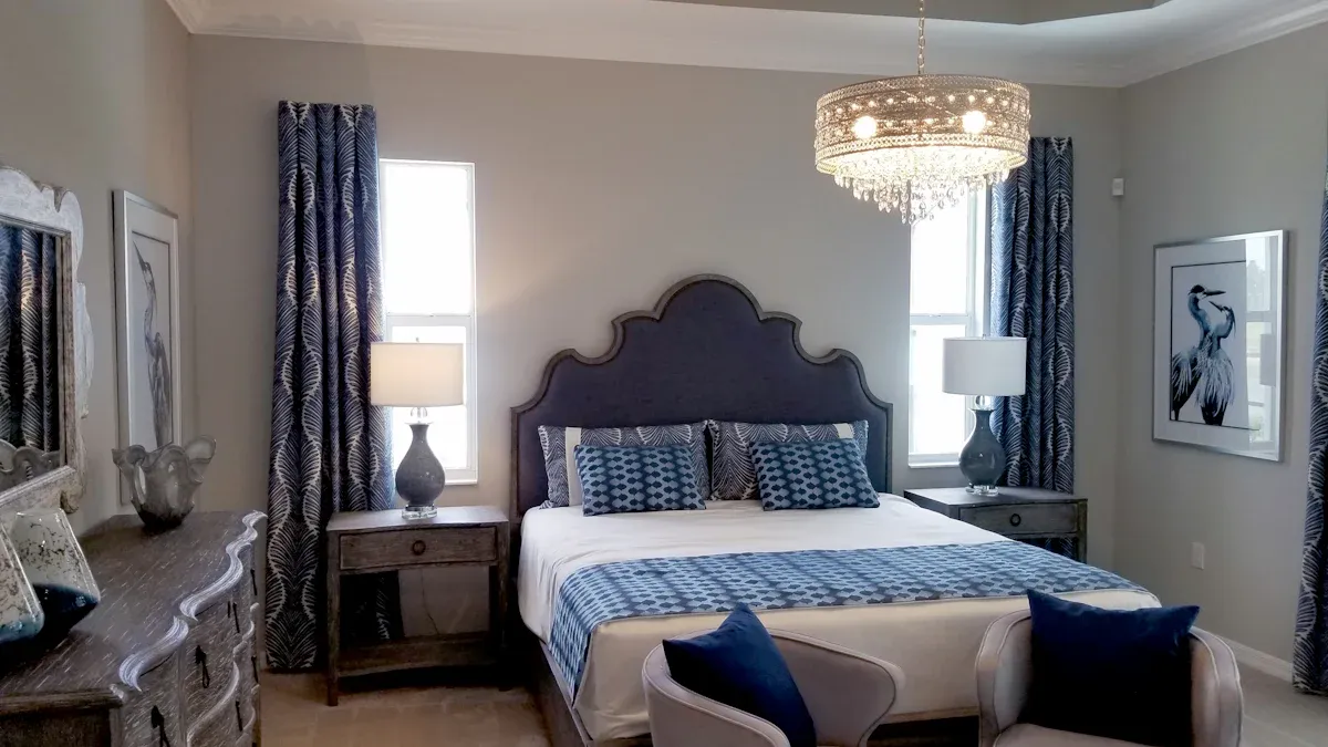
Deeper gray-blue paint colors add drama and sophistication to your space. You can use them on accent walls, in studies, or in bedrooms for a cozy, enveloping feel. These rich shades evoke the deep ocean or a stormy sky.
Consider these dramatic choices:
Sherwin-Williams’ Eventide: This color captures the calm sea on a cloudy day. It offers a deep, contemplative blue-gray.
Sherwin-Williams’ Grays Harbor SW 6236: This deep blue-green-gray adds richness and depth. It instantly makes any space feel more sophisticated.
Sherwin-Williams’ Naval SW 6244: A classic deep navy, Naval brings a strong, elegant statement.
Sherwin-Williams’ Favorite Jeans SW 9147: This color offers a comfortable, lived-in feel, like your favorite pair of jeans.
Sherwin-Williams’ Moscow Midnight SW 9142: This deep, mysterious blue-gray creates a dramatic and luxurious ambiance.
Sherwin-Williams’ Slate Tile SW 7624: A dark, earthy gray with blue undertones, Slate Tile provides a solid, grounding presence.
These deeper hues create a powerful visual impact. They are excellent for adding a focal point or a sense of intimacy.
Exploring Blue-Gray Paint Colors and Undertones
Understanding undertones is crucial when you select blue-gray paint colors. Undertones are the subtle colors that appear beneath the main shade. They significantly influence how a paint color looks in your home. Dr. Eleanor Martens explains that ambient lighting and surrounding colors greatly affect how you perceive bluish-gray hues. This variability is important for precise color application.
Blue-gray paints often mix primary blue pigments with black, white, or sometimes green or purple undertones. For example, a “storm gray” might have a dominant blue with hints of black or charcoal. This creates a sophisticated look. A “sea mist” shade could include subtle green undertones. This evokes a fresh, moist sensation.
You will find that warm grays, often called “greige,” feel more invigorating. Cool grays, on the other hand, create a sense of tranquility. This idea of warm versus cool undertones applies to all colors. It influences the mood you feel from the paint. You must consider these undertones to achieve your desired coastal effect.
Selecting Coastal Blue Paint Colors for Your Home
You want to choose the right coastal blue paint colors for your home. This involves more than just picking a shade you like. You must consider several factors. These factors ensure your chosen paint looks its best and creates the serene coastal atmosphere you desire.
Assessing Natural Light Impact
Natural light significantly changes how a paint color appears. A color can look different in a brightly lit room compared to a dimly lit one. Strong natural light can make colors seem lighter and more vibrant. Less light can make them appear darker and sometimes duller. Always observe how light enters your room throughout the day. This helps you understand how your chosen shade will behave.
Room Orientation Considerations
The direction your room faces affects its natural light. This impacts how gray-blue shades look.
South-facing rooms get strong, clear light. This light is warm and consistent. In these rooms, a neutral with a cooling hint of blue, green, or violet can balance the light’s intensity. This helps maintain a sense of serenity. Cool-toned colors, like gray-blue, may appear more neutral here. They can balance the strong warmth. Most colors work well in south-facing rooms. However, avoid overly warm colors. They might become too intense.
North-facing rooms receive cooler and less light. Cool-toned colors, such as gray-blue, can make these rooms feel even colder. It is generally best to avoid them. Colors with a green, gray, or blue base risk appearing cold and drab. Instead, choose neutrals with warming undertones. You can also embrace the cooler light with deep, dark grays or taupes that have warmer undertones. This creates a cozy atmosphere. You can temper cool tones in a coastal palette by using warmer shades like Curio Gray. This adds a touch of warmth to balance the coolness.
Harmonizing with Existing Decor
Your new blue-gray paint colors must work with your existing furniture, flooring, and architectural elements. This creates a cohesive look.
Consider the 60-30-10 rule for balance:
60% Neutrals: Use these for walls, ceilings, and large furniture.
30% Bold Colors: Apply these to secondary furniture, rugs, or feature walls.
10% Accent Colors: Use these for decorative items like pillows, artwork, and lighting fixtures.
When you harmonize gray-blue paint colors, think about these elements:
Architectural Features: Highlight or minimize features like molding, built-in cabinetry, or exposed beams. Choose appropriate colors.
Trim and Molding: Painting all trim the same color creates unity. The trim color influences the entire palette.
Ceiling Color: White ceilings make rooms feel taller. Slightly lighter versions of wall colors create intimate spaces. Accent colors can highlight interesting ceiling details.
Flooring: Flooring establishes undertones. These should complement wall and accent colors. Dark floors provide contrast. Light floors offer flexibility.
Lighting: Natural daylight provides the truest color representation. Artificial lighting (incandescent, LED) can alter color appearance. Test colors under various lighting conditions. Check them in the morning, afternoon, evening, and under artificial light. This ensures they look good throughout the day.
You can also use a 3-Way Harmony Framework:
Identify Undertones: Determine the hidden hues in paint, furniture, and flooring. For example, cool gray walls might clash with red oak furniture. Cool undertones pair well with chrome, lacquer, and cool-toned wood.
3-Way Harmony Framework: Start with the dominant surface, usually the floor. Identify its undertone and texture. Then, define the wall tone and finish. Choose a shade lighter or darker than the floor. Match the undertones. Finally, introduce furniture as the visual anchor. Ensure consistency in undertones.
Test Visual Flow: Use a color swatch board. Check it under natural daylight and interior lighting. Incorporate rugs and accent items. This bridges tones between surfaces.
Unifying Elements: Use rugs to anchor furniture. They bridge tones between dark floors and light walls. Art can echo furniture tones. Lighting, like warm LED lights with cool materials, can restore balance.
The Importance of Testing Samples
You must test paint samples before committing to a color. This step is crucial for accurate color selection.
Follow these steps for testing:
Purchase sample-sized containers (2-4 ounces) of your top color choices.
Paint large swatches (at least two feet by two feet) directly on your walls. Apply two coats. Use the same method as the final job.
Position test swatches strategically around the room. Account for varying lighting conditions. Include shadowed areas and direct sunlight. Place them on walls viewed from main seating areas.
Live with the color samples for at least a full week. Observe them in the morning, afternoon, and evening. Look at them under both natural and artificial light.
Consider advanced strategies. Create a color story for adjacent spaces. Understand undertones. Test colors against existing furnishings and decor.
You can also utilize peel-and-stick paint samples. They offer accuracy and ease of use. Traditional paint samples may not be the actual paint formula. They can also be messy. Observe paint samples at different times of day and in various weather conditions. This helps you understand how colors change with light. Place samples on a variety of walls within the room. This accounts for different lighting exposures, such as direct sunlight versus shadowed corners. View paint samples against a neutral background, like white printer paper. This prevents the current wall color from distorting your perception of the sample’s true hue.
Decorating with Gray-Blue for a Coastal Look
You can transform your home into a serene retreat. Use gray-blue paint colors as your foundation. Then, add complementary elements. These elements create a cohesive and inviting coastal atmosphere.
Complementary Color Palettes
You need to choose the right color schemes to enhance your gray-blue walls. These choices create a harmonious coastal color scheme. Consider these palettes:
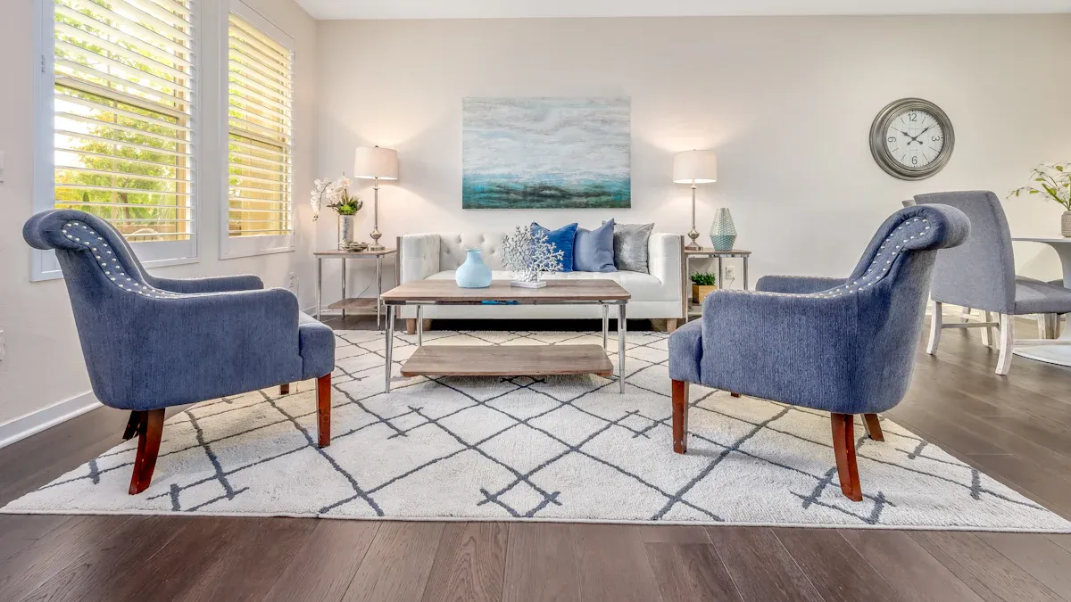
Coastal Breeze Palette: Sky blue, steel blue, cadet blue, light steel blue, and dark slate gray create a refreshing ambiance.
Ocean Depths Palette: A rich blend of blue and teal hues brings calmness and tranquility.
Serene Waters Palette: Turquoise, light sea green, cadet blue, steel blue, and powder blue offer a soothing visual flow. You can also use soft whites, muted greens, or warm beiges. These colors create a harmonious design. Accent colors like mustard yellow or coral add a pop of interest.
Natural Textures and Materials
Natural textures and materials are essential for a coastal look. They add warmth and authenticity. You can use light woods, like white oak, for flooring or large furniture. These woods add warmth without overwhelming the space. Rattan and wicker naturally evoke coastal charm. They pair beautifully with ocean-inspired blues. Jute works well for area rugs. It anchors seating areas. Linen and cotton are ideal for softer textiles and curtains. They add softness and reinforce the theme. Natural fabrics such as linen and cotton are a priority. Weathered wood furniture, jute rugs, and rattan mirrors are excellent choices for furniture and accessories.
Coastal Accents and Decor
Specific accents and decor items complete your coastal living spaces. They give your home a stylish seaside vacation home vibe.
Artwork: Choose lighthouse prints, coastal scenes, or nautical wall art.
Mirrors: Rope-framed, driftwood-inspired, or distressed mirrors add character.
Textiles: Use linen, cotton, embroidered pillows, airy curtains, or soft towels in ocean hues.
Accents: Glass bottles, vases, seashell or starfish figurines, nautical clocks, lanterns, wicker baskets, and distressed signs enhance the theme.
Materials/Finishes: Wicker, rattan, rope details, and weathered wood finishes are perfect.
Enhancing Ambiance with Lighting
Lighting plays a crucial role in a gray-blue room. Blue-gray paint adapts well to changing light. It maintains a peaceful mood from morning to night. This paint provides enough depth to make the room feel cozy. For example, a blue-gray shade might appear more gray in morning light. It looks more blue in the evening. Similarly, some blue-gray colors show more blue in natural daylight. The gray becomes more prominent in artificial light. You should test paint colors at various times of day. Blue can appear gray in morning light and more vibrant in afternoon sun. Use warm-toned bulbs (2700K-3000K) for artificial lighting. This prevents blue walls from feeling stark or cold in the evening. Combine ambient ceiling fixtures, task lighting, and accent lighting. This strategy creates depth and warmth in the room.
Common Mistakes to Avoid with Gray-Blue Paint
You want to create a beautiful space with gray-blue paint. However, you can make some common mistakes. Knowing these pitfalls helps you achieve your desired look.
Ignoring Undertone Nuances
You must understand paint undertones. Undertones are subtle colors within a main shade. A blue-gray color might have green, purple, or even warm brown undertones. These hidden colors greatly affect how your walls look. For example, a gray-blue with green undertones can appear more aqua in certain lights. One with purple undertones might look cooler. Always check the undertones of your chosen paint. This ensures it matches your room’s lighting and existing decor. Ignoring undertones can lead to a mismatched or unexpected result.
Skipping Sample Testing
You should never skip testing your paint. This is a crucial step. A paint color looks different on a small chip than on your wall. Light conditions change throughout the day. They also vary from room to room. Always buy small samples of your favorite gray-blue shades. Paint large swatches directly onto your walls. Observe these samples at different times. See them in morning light, afternoon sun, and evening artificial light. This helps you see the true appearance of the paint. It prevents costly mistakes.
Overdoing the Coastal Theme
You want a serene coastal vibe. However, you can use too many themed items. This makes your room feel cluttered or kitschy. The goal is a sophisticated coastal feel, not a souvenir shop. Use gray-blue paint as your foundation. Then, add subtle coastal accents. Think natural textures like linen and wood. Choose a few well-placed items like a piece of driftwood or a shell. Avoid filling every surface with anchors, seashells, or fishing nets. A balanced approach creates a truly elegant and relaxing coastal space.
You can transform your home into a serene coastal sanctuary. Gray-blue paint colors offer this power. They bring tranquility, spaciousness, and timeless appeal. Confidently choose your ideal shade. Consider your room’s light, the paint undertones, and your existing decor. Thoughtful decor choices will complete your desired peaceful atmosphere. You can bring the calming essence of the sea indoors for everyday relaxation.
FAQ
How do I pick the best gray-blue paint for my room?
You must consider your room’s natural light. Test samples on your walls. Observe them at different times of day. This helps you see how the color changes. Also, check for subtle undertones.
What colors complement gray-blue paint for a coastal look?
You can pair gray-blue with soft whites, sandy beiges, and muted greens. Natural wood tones also work well. For accents, try coral or mustard yellow. These choices create a harmonious coastal feel.
Is gray-blue paint suitable for small rooms?
Yes, light and airy gray-blue shades work well in small rooms. They reflect light. This makes your space feel larger and more open. Avoid very deep hues in tiny areas.
How can I prevent a gray-blue room from feeling too cold?
You can add warmth with natural textures. Use wood furniture, woven rugs, and soft textiles. Incorporate warm accent colors. Use warm-toned lighting. This balances the cool tones of the paint.