
You can transform any space with blue-green paint colors. These beautiful hues bring together the calm of blue and the fresh feel of green. This unique blend creates a truly serene and refreshing environment. A beautiful paint color can foster a sense of peace in any room. We will guide you through selecting and using these calming colors effectively in your home. Discover their tranquil qualities and incredible versatility.
Why Blue-Green Paint Colors Calm
Psychology of Blue-Green: Serenity and Nature
Blue-green paint colors bring the calm of nature indoors. These colors remind you of the sea and sky. You find them in places like water surfaces and tree canopies. This connection helps you feel renewed and peaceful. Blue is a powerful color for calm. It lowers your heart rate and reduces stress. Blue helps you focus and supports your mental well-being. It makes you feel serene and stable.
Green symbolizes nature and growth. It promotes harmony and peace. Green reduces stress and helps you relax. It connects you to the natural world, improving your mood. Together, blue and green create a powerful calming effect. They promote balance and well-being in any room.
Versatility Across Design Styles
Blue-green hues fit many design styles. Companies use blue and green in healthcare and finance. This shows how these colors evoke trust and stability. You can use them in modern or traditional settings. For example, soft blues and greens create a relaxing atmosphere in bedrooms. They are also perfect for coastal style homes, bringing the ocean’s calm inside. These blue-green paint colors adapt easily. They provide a serene feeling no matter your home’s look.
Best Blue-Green Paint Colors to Consider
You want to find the perfect shade for your home. This guide helps you explore the best blue green paint colors available. You will discover options from soft and muted to bold and dramatic. Each category offers unique qualities to transform your space.
Soft & Muted Blue-Green Shades
Soft and muted blue-green shades create an airy, tranquil feel. These colors are perfect for spaces where you seek calm. They offer a gentle touch of color without overwhelming the room. You can find many beautiful options from popular brands. Consider Benjamin Moore’s Mystic Lake, Sweet Dreams, or Beach Glass. Other choices include Healing Aloe, Sea Foam, and Palladian Blue. Wythe Blue, Buxton Blue, and Woodlawn Blue also offer a serene touch. You might like Silver Crest, Bali, Picnic Basket, Grenada Villa, Gossamer Blue, Florida Keys Blue, or Wedgewood Gray.
These shades bring specific moods to your home. Provence Blue is a dusty mid-range blue-green. It fosters a peaceful and nurturing atmosphere. This makes it ideal for a calm interior. Blue Gray is a subtle shade. It changes appearance with varying light. You can use it in light-filled hallways or sitting rooms. Spring Mint is a bright, refreshing green with a hint of blue. It illuminates spaces and evokes a tranquil seaside breeze. This color works well for primary bedrooms or bathrooms. Aquamarine Dream brings tranquility and rejuvenation. It looks particularly effective in modern interiors. Pair it with sleek furniture for a sophisticated look. Dix Blue is an elegant, vintage-inspired blue-green. It adds sophisticated joy to any space. You can use it for breezy guest bedroom schemes or as a trim color. These soft blue green options provide a soothing blue green paint color for any room.
Vibrant & Deep Blue-Green Tones
Vibrant and deep blue-green tones make a strong statement. These colors create a rich, immersive atmosphere. They are perfect when you want to add depth and personality to a room. You can use them to create a moody sanctuary. This gives you a place for recharging. These tones offer a brooding yet deeply impressive look. They carry regal connotations. You can display them best in sumptuous velvet fabrics. They are ideal for painted walls. You can also find them effective in metallic wallpapers. Consider a bold and dramatic blue green paint color like Aegean Blue or a deep Hunter Green with blue undertones. These choices add significant impact.
Teal & Turquoise Blue-Green Options
Teal and turquoise blue-green options bring energy and a pop of color. These hues combine the traits of both green and blue. They add unique dimensions to your decor. Their positive energies include neatness, self-confidence, and stability. Using teal can help a space appear well-groomed. It can also elicit admiration.
Turquoise is a vibrant and refreshing shade. It evokes the calmness of tropical waters. It brings an energizing and refreshing atmosphere to interiors. People often choose it for coastal or eclectic decor. Teal is a rich, jewel-toned hue. It sits between blue and green. Teal is bold, luxurious, and dramatic. It adds depth and personality. It creates a sense of allure. You can use teal effectively as an accent in contemporary or eclectic spaces. It enhances visual interest and sophistication. Turquoise embodies the characteristics of wood and water. It offers the contemplative aspects of blue and the vitality of green. This makes it an excellent choice for spaces that encourage movement and growth.
Popular choices include Farrow & Ball Inchyra Blue and Stone Blue. Sherwin Williams offers Tempe Star, Seaworthy, Riverway, Still Water, and Refuge. Benjamin Moore has Newburg Green and Aegean Teal. Dunn Edwards Nocturnal Sea and Magnolia Home Weekend are also great options. Romabio New Hope and Farrow & Ball De Nimes provide more choices. You might also consider a gorgeous peacock blue paint color for a truly striking effect.
Sophisticated Gray-Green-Blue Hues
Sophisticated gray-green-blue hues offer neutrality and elegance. These colors blend the calming qualities of blue and green with the grounding effect of gray. They create a refined atmosphere. Benjamin Moore Oyster Shell has significant green undertones. Its appearance changes based on room lighting. Valspar Pale Linen is a pure green-blue with less gray. It feels fresh and airy. Benjamin Moore Wickham Gray is similar to Oyster Shell. It may be less intense. The amount of blue or green depends on the light.
Other excellent choices include Benjamin Moore Gray Owl. It features subtle blue-green undertones. It offers a cool, calming effect that varies with lighting. Benjamin Moore Boothbay Gray is a gray paint with prominent blue undertones. It gives a clean and inviting feel. Benjamin Moore Gibraltar Cliffs is a moody mix of blue and gray with green undertones. Some people see more gray, others more blue. Benjamin Moore Stonybrook is a medium-toned blue-gray. It has a touch of green undertones. It sometimes appears more green and sometimes more blue. Sherwin Williams Network Gray has a decent blue undertone. It avoids strong green or purple leans. Farrow & Ball Blue Gray can appear more green in ample yellow sunlight. Benjamin Moore Cloudy Sky 2122-30 has steely blue-green undertones. It creates a moody, romantic ambiance. Clare Paint – Set in Stone is a strong and moody blue-gray. It may read slightly purple in some spaces. Benjamin Moore Eclipse 2132-40 is a dark, moody gray. It sharpens with a hint of blue. Farrow & Ball Hague Blue 30 is a strong blue with green undertones. It feels like a rich teal.
These sophisticated gray-green-blue hues create a neutral and elegant atmosphere in various spaces. Celadon green is a harmonious blend of blue and gray. It is serene, sophisticated, and elegant. You can use it for styles like Vintage, English Country, French Country, Hamptons, Scandinavian, and Minimalist. It works as a dominant color or a subtle accent. It infuses tranquility and understated elegance into a space. These are some of the best blue green paint colors for a refined look. You can find great paint color inspiration here. This offers excellent color inspiration for your next project.
Blue-Green Paint in Every Room
Blue-green shades work well in many different rooms. They even suit counseling and therapy rooms. These colors create a calming atmosphere. You can use classic midtone blues for living rooms. Vibrant turquoise works well for breakfast rooms.
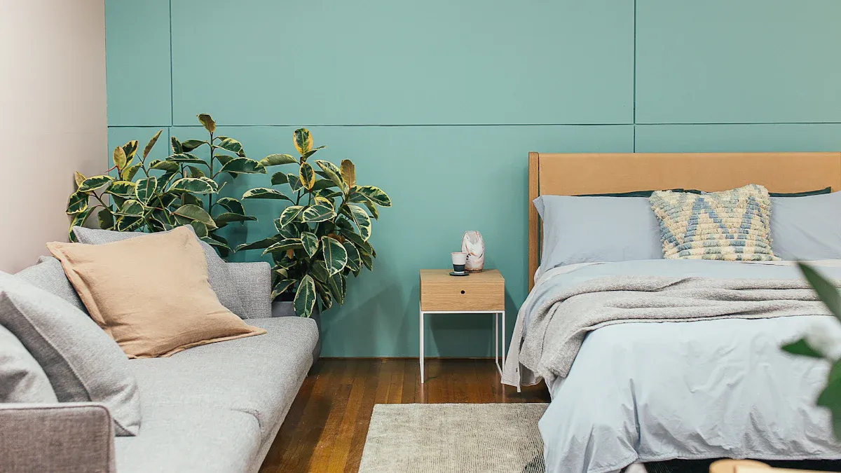
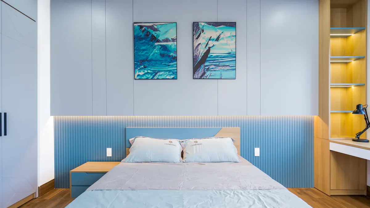
Bedrooms: Creating a Serene Sanctuary
You can turn your bedroom into a peaceful retreat. Blue-green paint colors help you do this. They promote rest and relaxation. Consider these gentle blue-green options for your walls:
Benjamin Moore’s Quiet Moments: This color changes subtly with natural light.
Benjamin Moore’s Palladian Blue: This soft shade brings outdoor calm inside.
Benjamin Moore’s Beach Glass: It gives you peaceful coastal feelings.
Sherwin Williams’ Rainwashed: This blue-green adapts well to changing light.
Sherwin Williams’ Sea Salt: It has green-gray undertones and calms you.
YesColours Serene Green: This gentle color has delicate blue undertones. It combines green and blue for a relaxing bedroom.
You can enhance the tranquility in your bedroom. Pair blue-green paint with other design elements. Black or beige tones create an elegant look. Pale pink or rich coral offer complementary aesthetics. Light neutral bedroom furniture, like nightstands or dressers, also complements blue-green-gray paint colors. This helps create a truly serene bedroom.
Bathrooms: Spa-like Retreats
Transform your bathroom into a spa-like escape. Blue-green shades are perfect for this. Imagine a color gradient where a soft blue deepens into a rich teal. This evokes the calmness of ocean waves.
Aqua or Turquoise: These vibrant blue shades remind you of tropical waters. They make your bathroom feel like a vacation spot. They pair well with natural textures like wood or stone.
Teal: This mix of blue and green creates a deep, ocean-inspired look. It works well for a dynamic bathroom. Teal complements matte black fixtures and natural wood finishes.
You can add accessories and fixtures to complete your spa aesthetic. Incorporate blue decorative items. Use blue trays, towel holders, soap dishes, or vases. Choose blue towels, runners, or rugs. This grounds the space and enhances the color scheme. For a minimalist design, use dusty blue as the main color. Pair it with sleek fixtures and simple decor. Keep surfaces clutter-free. This creates a zen-like feel. You can also create an organic spa atmosphere. Combine soft spa blue walls with natural wood elements. Use wooden floating shelves, bamboo accessories, and teak bath mats. These add warmth to cool blue tones. Add warm elements like brass fixtures or woven baskets. This prevents the bathroom from feeling cold.
Living Rooms: Inviting and Relaxing Hubs
Your living room should feel inviting and relaxing. Blue-green paint colors help you achieve this. Interior designer Nicole Gibbons says blue or green shades relax you. Science supports this. Shorter wavelengths of blues and greens are easier for your eyes to process. This lowers stress. A color marketing manager at Benjamin Moore notes that navy blue is timeless. It brings a comforting feeling to any room. It offers a sense of security, like the evening sky.
Deep jewel tones, like emerald green and sapphire blue, create a “cocoon effect.” Designer Malak Bellajdel says this works well in smaller rooms. It makes them feel grounded and enveloping. Designer Dawn Bane explains “color-drenching” a space. Using one deep color, like Sherwin-Williams’ ‘Waterloo,’ eliminates stark contrasts. It makes the room feel like it is hugging you. Muted or deeper blue-green tones, such as a smoky sage green (Farrow & Ball’s “Green Smoke”), are calming and cozy. They add warmth without overpowering the space. Lighter shades, like a pale blue, make a room feel airy and calm. Medium shades, such as mossy green or dusty blue-green, are the coziest. They are inviting but also soothing. Deep blues like ‘Hale Navy’ by Benjamin Moore are rich and inviting. They do not feel claustrophobic.
Kitchens: Fresh and Uplifting Spaces
You can make your kitchen fresh and uplifting. Blue-green paint colors are a great choice. Interior design expert Carlos Nyce says blue-toned greens are popular. This includes teals and emerald-adjacent hues. They connect to nature and have grounding effects. Blue-toned shades of lichen and eucalyptus also create a fresh look.
Benjamin Moore’s Fort Pierce Green: This color is ideal for cabinetry.
Sherwin-Williams’ Studio Blue Green: This is another great choice for cabinetry.
Benjamin Moore’s Mount Saint Anne: It adds a soft, sophisticated touch to kitchen walls. It pairs well with wood accents.
Sherwin-Williams Upward (SW 6239): This soft, light blue creates a fresh, airy feel. It works well in smaller kitchens.
Sherwin-Williams Rain (SW 6219): This complex color has light blue, subtle green, and gray undertones. It offers a sophisticated, clean look.
Benjamin Moore Palladian Blue (HC-144): This gentle blue-green creates fresh, coastal looks. Its subtle green undertones connect to nature.
You can combine blue-green hues for cabinets and walls.
Cabinet Color | Hue | Wall Color/Complementary Elements |
|---|---|---|
Pewter Green (Sherwin Williams SW6208) | Dark, calming green | White uppers, classic white subway tile backsplash, rich-toned red decor (e.g., runner), Spare White, Shoji White, Silvermist |
Manitou Blue (Sherwin Williams SW6501) | Teal blue/Greenish blue | Whites for perimeter cabinetry, chrome or brushed nickel hardware, Blue Horizon, Aged White, Khaki Shade |
Gale Force (Sherwin Williams SW7605) | Moody blue | Monochromatic blue scheme with varied textures/patterns, Extra White, Shiitake, Ultaupeia |
Faded Flaxflower (Sherwin Williams SW9146) | Gentle blue with cool yellow and gray undertones | Existing wood cabinetry, tricolor hexagon tile, Icicle, Gossamer Veil, Charcoal Blue |
Anchors Aweigh (Sherwin Williams SW9179) | Deep, saturated blue | Light upper cabinets (for contrast), or full deep blue drench |
Crisp white walls create clean backdrops. They let blue cabinets be the focal point. Light gray walls offer subtle contrast. They enhance blue cabinets without overwhelming them. Warm beige tones add coziness. They balance cooler blue hues. Lighter blue tones create sophisticated monochromatic schemes.
Home Offices: Fostering Focus and Calm
Your home office needs to foster focus and calm. Blue-green shades help you concentrate.
Light Blue: It enhances calmness. It is ideal for high-stress areas.
Soft Green: It promotes balance. It suits creative spaces.
Teal: It combines the benefits of both blue and green. This makes it versatile for multipurpose rooms.
Sky Blue: It enhances focus and calmness. It mimics clear skies. It creates a sense of openness in small offices.
Mint Green: It promotes relaxation without overwhelming you. It is ideal for creative spaces.
Navy Blue: It instills concentration and stability. It is perfect for large workspaces.
Hunter Green: It provides security and sophistication. It suits executive offices.
Refreshing green promotes balance and self-renewal. It alleviates stress and sharpens focus. It fosters superior concentration and productivity. Productive blue conveys calmness, stability, and focus. It reduces stress levels and enables better concentration. It enhances mental clarity and increases overall productivity. This includes soft blues and deeper navy tones. Blue tones evoke calmness, reduce stress, and promote productivity. They create a serene atmosphere for focus. Green hues symbolize growth and renewal. They foster creativity and innovation in your workspace. Light blue fosters focus and calmness in offices. It opens up smaller workspaces and reduces stress. Navy blue fosters focus and calmness in offices. It adds depth to larger areas while maintaining professionalism. Green fosters productivity. It brings a refreshing vibe and encourages creativity and balance. Soft greens create a tranquil atmosphere. Deeper greens add sophistication.
Choosing Your Perfect Blue-Green Shade

You want to select the perfect shade for your home. This requires careful consideration. You need to understand how different factors influence color appearance.
Lighting Considerations: Natural vs. Artificial
Natural light greatly affects how blue-green shades look. North-facing rooms receive less natural light. They get more cool light. This makes paint colors unpredictable. It magnifies cooler undertones. You should choose blue paint colors with warm undertones, like green or gray. This balances the cool light. It creates a more inviting atmosphere. You should also go one shade lighter than you desire. This accounts for poorer lighting conditions. Some colors are “chameleons.” Sleigh Bells shifts between blue and green. Farrow & Ball’s Green Blue can look almost dark gray. Sherwin-Williams Hunt Club changes between green and blue. Behr Opal Silk appears bluer in light and greener as the sun sets.
Artificial lighting also changes how these hues appear. Different light types have different effects.
Lighting Type | Effect on Blue-Green Paint Shades |
|---|---|
Incandescent | Makes cool colors like blues and greens appear duller. |
LED (Cool White) | Enhances their crispness and vibrancy. |
LED (Warm White) | Can make these colors look muted or even grayish. |
Understanding Color Undertones
The pigments mixed to create a color determine its undertone. A blue paint color might have a green undertone. This happens if its formula includes more green pigments. You can identify undertones.
Compare your chosen color to similar colors from the same range. This shows subtle differences.
Place the color swatch next to a pure version of that color. A gray next to a neutral gray reveals its undertones.
For neutrals, place the swatch next to pure red, yellow, green, blue, orange, violet, and yellow. The complementary color highlights the undertone. Red brings out a green undertone in a neutral.
The Importance of Testing Swatches
You must test paint swatches. This ensures color accuracy.
Use movable sample boards. Observe colors under various lighting conditions. Look at them throughout the day and in different rooms.
Apply larger test patches directly on walls. Make them about 2×2 feet. Small swatches can mislead you.
Apply two coats of paint. This gives an accurate color representation.
Utilize peel-and-stick samples. You can move them around different spaces. See how the color looks under various lighting conditions.
Ensure proper wall preparation. Clean and prime walls before applying samples. This ensures accurate color representation.
View swatches at different times of day. Check them under various lighting conditions for at least 24-48 hours.
Check the painted sample during bright morning sun, at midday, under regular house lights, and during sunset.
Allow at least three days before making a final decision. Paint looks different throughout the day.
Harmonizing with Existing Decor
You need to consider your existing decor. Your chosen paint color should complement your furniture and accessories. Think about the overall feeling you want in the room. This helps you find the right paint color inspiration.
Decorating with Blue-Green: Complementary Hues
You can enhance blue-green paint colors with complementary hues. These pairings create a cohesive and inviting space. Consider different elements to complete your room’s look.
Pairing with Neutral Colors
You can create a balanced look. Pair blue-green shades with neutral colors. Neutrals like white, beige, and gray provide a calm backdrop. They allow your blue-green walls to stand out. This combination creates a sophisticated and serene atmosphere. You can use neutral furniture. Add neutral textiles. This keeps the focus on your chosen wall color.
Adding Warm Metallic Accents
Warm metallic accents enhance your blue-green scheme. Gold accents add opulence. This creates a luxurious atmosphere. You can use gold in living rooms or bedrooms. Brass or gold metals pair well with deep green and blue undertones. This gives a luxe feel. Consider aged brass or gold. They create an old-world feel with verdigris. Copper accents also add glamor. They bring sophistication to your space. This metallic touch elevates your entire color palette.
Contrasting Pops of Color
Add contrasting colors for a lively pop. These colors create visual interest. Warm yellows bring vibrant energy. Corals and oranges offer a bold look. They make your room feel lively. Deep reds provide a rich contrast. They add drama to your space. Bright pinks introduce a playful element. They make your room cheerful. Choose accents like throw pillows or artwork. These small touches make a big impact on your color palette.
Incorporating Natural Elements
Natural elements harmonize beautifully with blue-green. Wood furnishings create warmth. Stone accents add texture. Sea green, a type of blue-green, pairs well with wood furniture. You can use open shelving in lighter wood tones. Indoor plants bring life to your room. They connect your space to nature. Stone accessories also complement these hues. Wicker items add a natural, relaxed feel. Use wooden furniture for outdoor areas. Stone planters work well too.
Blue-green paint colors truly transform your home. They create calming and beautiful spaces. You now understand their unique benefits, incredible versatility, and practical application tips. These include considering lighting and testing swatches. We encourage you to experiment with different blue green paint colors. Find the perfect hue that matches your personal style. This enhances your home’s atmosphere, creating truly serene and rejuvenating environments.
FAQ
What is the difference between teal and turquoise?
Teal blends blue and green. It often has a deeper, richer tone. Turquoise is a brighter, more vibrant blue-green. It reminds you of tropical waters. Both add energy to your space.
What makes a blue-green paint color “muted”?
Muted blue-green shades contain gray. This softens their intensity. They create a subtle, calming effect. These colors feel airy and tranquil. They do not overwhelm a room.
What are common undertones in blue-green paints?
Blue-green paints often have gray, yellow, or even purple undertones.
Gray undertones make the color sophisticated.
Yellow undertones add warmth.
Purple undertones can make the color appear richer.
What does “color drenching” mean with blue-green paint?
Color drenching means painting walls, trim, and sometimes ceilings the same blue-green shade. This creates an immersive, enveloping feel. It makes a room feel cozy and grounded.
What is a “chameleon” blue-green paint color?
A chameleon color changes its appearance. It shifts between blue and green. This happens based on the light in your room. Behr Opal Silk is one example. It looks bluer in bright light. It appears greener as the sun sets.